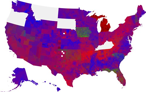
In his prediction post at FiveThirtyEight.com yesterday, poblano predicted that John Edwards would win a greater amount of the vote in West Virginia because of a specific ballot quirk: the candidates' hometowns were listed on the ballot. The prediction was predicated on the idea the some undecided or weakly leaning voters may be swayed by seeing "Chapel Hill, NC" next to "Chicago, IL" and "Chappaqua, NY".
And this prediction turned out to be correct. John Edwards had the strongest performance that he's had since February 5, when he won 10.2% of the vote in Oklahoma despite suspending his campaign earlier that week. This time he pulled an impressive 7.3% of the vote three months after suspending his campaign.
Because of this, West Virginia stands out in the map of Edwards' vote percentage compared to the surrounding states:
West Virginia and Tennessee, which gave Edwards 4.5% certainly are perhaps the most similar, though because Tennessee has some larger cities, Edwards didn't win the same proportion of the vote.
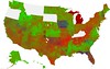
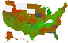
The Obama and Clinton maps (first and second respectively) also show some interesting patterns and a warning for Obama:
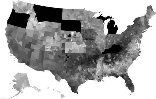
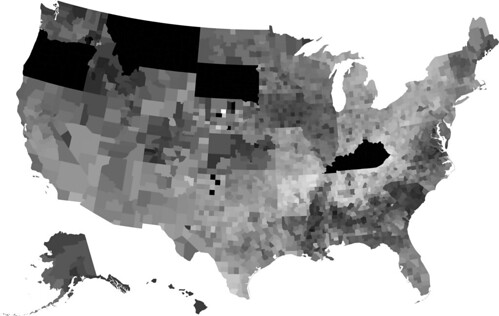
As you can see, Obama clearly did worse than he did in Virginia (there's a precipice of Obama support at the VA-WV border as well as an uptick in Clinton support despite the dramatic increase in Edwards support in the same area. I think Obama could have done better, particularly in the eastern part of the state had he taken more time to campaign there.
However, taking into consideration how Obama looked after campaigning in Indiana and North Carolina, perhaps getting some rest from the campaign trail was a wise decision on the balance.
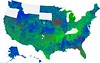
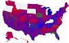
Of course, to keep up with the series, here's the updated color map:
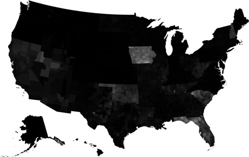
I didn't update the modified Michigan and Florida maps this time around, since it was only one state that was voting this time around. However, as long as I do not have a map that is weighted according to voter density, I'm going to include a map of Kerry voter density (in Kerry voters per square mile on a logarithmic scale):
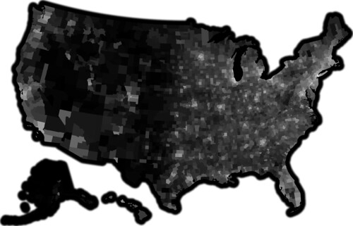
Apologies to Alaska, which is actually the largest state by land area and is thus "undercounted" by this map.
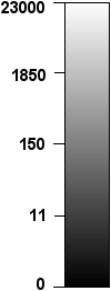
If you look more closely at West Virginia:


And compare it to the Kerry voter density map of the state:
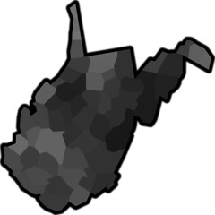
You'll notice that there remains a correlation between population density (or Kerry voter density, if you want to be picky) and Obama's level of support. For that reason, I suspect that Kentucky won't be quite as bad, despite the look of the surrounding states, since both Louisville and Lexington are significantly larger than the largest city in West Virginia, Charleston. That coupled with a win in Oregon should make for a nice wrap up to the May contests.
