Now that Pennsylvania has voted, it's time to release an update to the primary map. This time, I don't have many variants, because I decided to switch to a different template for my map, using an SVG graphic as the original template, which can be better resized and allowed me to do away with the boundaries which obscure some of the trends between states.
I think it's pretty clear that Pennsylvania voted in a similar fashion to the surrounding states and that it adds even more clarity to the future contests.
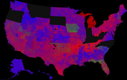
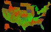
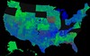
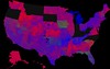
Larger versions of the maps are available on Flickr (just click on the image to get to its Flickr page). In the above version, blue represent Obama, red represents Clinton, and green represents Edwards. If you don't like these colors, there are color swapped versions below the fold.


In some ways this is a step back, as I haven't yet divided Alaska into state house districts and I haven't yet made the same modified map versions as before.
I will hopefully have a greater array of modifications ready after the May 6 primaries.
