In the past few weeks, with no primaries since Mississippi and almost a month until Pennsylvania, the focus of the campaign has been off the horse race and onto campaign bickering through comments made by surrogates, candidates, and their associates as the media attempts to boost ratings by drumming up outrage.
As there have been no new contests, I haven't been able to add any state results to my map of the primaries so far, but that doesn't mean I haven't been able to make some major changes.
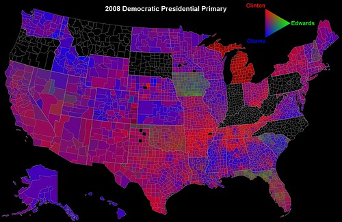
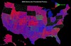
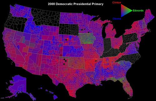
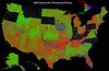
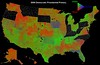
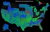
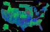
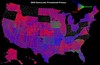
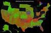
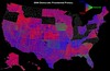
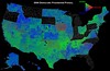
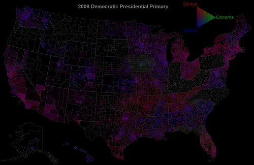
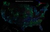
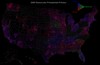
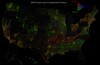
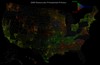
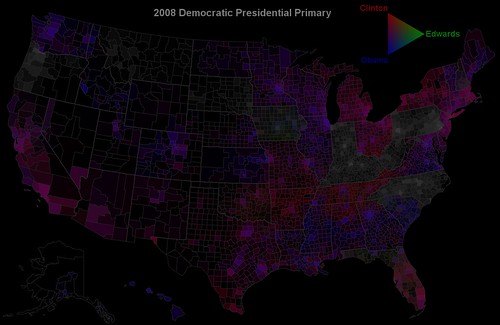
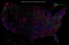
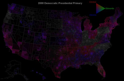
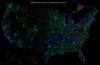
Larger versions of all maps in this diary are available by clicking on the map. The small maps are color swapped versions of the large map above them. Color swapped versions of the above map and many more are past the jump

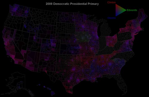
The updates in the map above are a darkening of the boundaries between counties and states, a subdivision of Kansas by state senate district instead of congressional district, subdivision of Nebraska by county instead of by congressional district, and the replacement of the color scale at the top.
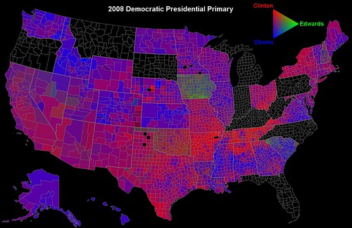
One of the difficulties with making this map has been the nature of the Michigan and Florida contests. Since they were both stripped of delegates by the DNC Rules and Bylaws committee last fall for violating both the spirit and letter of the DNC scheduling rules and since no candidate campaigned in either state beyond a few private fundraisers after that decision, with Barack Obama, John Edwards, Bill Richardson, and Joe Biden taking themselves off the Michigan ballot, they lacked a certain legitimacy.
However, for past maps as well as the above map, I have treated them as if they were normal contests, but this time, I've also created a few modified versions that treat the two contests differently.
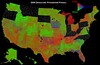
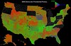
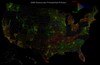
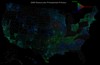
Modified Michigan map
In this map, "Uncommitted" votes in Michigan are treated as if they were votes for Obama. There are several reasons that I did not originally do this. Among them were the fact that Edwards was still in the race and one cannot truly tell the mind of voters. Furthermore, many potential voters probably decided to stay home knowing that their vote wouldn't count towards any national convention delegates. This is evidenced by the fact that Florida and Michigan were some of the few states where Republican primary voters outnumbered Democratic primary voters.
As a result of these issues, Michigan was significantly more "pro-Clinton" than the surrounding states, with the border counties in Michigan being more "pro-Clinton" than their neighbors in both Wisconsin and Ohio
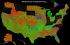
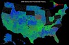
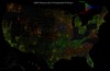
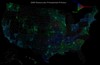
Map with Michigan Removed
Of course, instead of dealing with a montone Michigan or one where one voting option was treated as if it was a vote for someone who was not on the ballot, Michigan can simply be removed from the map.
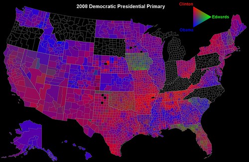
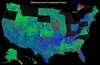
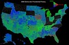
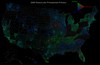
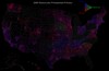
Map with Florida and Michigan Removed
The final modification is to remove both states from the map to show that no legitimate primaries have been held in either state.
One of the criticisms that I have received over this map is that it unfairly rewards rural counties, which have a large amount of land spread between a relatively small set of people and thus, while they represent a vast majority of the map's area, they actually contain a minority the nation's voters.
This effect can be seen in Missouri, where, if you have been following the race, you would know that Barack Obama narrowly beat Hillary Clinton in the popular vote there, but looking at the map above, the average observer might think that Senator Clinton won by a landslide because of her strength in rural areas. The same could be said of this USAToday map of the 2000 election, which makes it look like a Bush landslide despite the fact that Gore won the popular vote.
This was a problem encountered by Robert J. Vanderbrei, a computer science professor at Princeton, who created the Purple America map, which was the original inspiration for my map. Some people asked him if he could make a map that was darkened in less populated areas to correct for this problem. Here's his response:
Can you make the areas with high population density brighter than those with low density? Yes, I tried that. The trouble is that the big cities are so much more densely populated than everywhere else that the map appears black with just a few small bright counties. Unfortunately, computer monitors have a dynamic intensity range of just 256 and this is not enough for an intensity differentiated map. I experimented with some nonlinear transformations (such as a logarithmic or gamma-power law) and so doing was able to make a map with darker, but not black, unpopulated areas. But, this seems even more misleading because the viewer is told that the intensity represents population density and then thinks more people live in the unpopulated areas than actually do---the correct luminosity is virtually black. So, instead, here is a map from the International Dark Sky Association. It shows quite dramatically where most people live.
Eventually, he made a 3-D version where counties were assigned heights proportional to the number of votes per area in a given county. However, I think that the reasoning he used is a bit faulty. While it is true that there is a vast difference in population density between major urban centers and rural areas such that a proportional representation by lighting would leave most of the map dark. Indeed, if Manhattan were set at an intensity of 255 (the maximum), Cook County, IL, where Chicago is located, would have an intesity of 20, which would make it barely visible and in fact, most of the US outside New York City would be virtually or totally black.
So what is the best option? It's one that Vanderbrei tried and discarded and that is the logarithmic scale. While it is true that if one were to take an average of the color levels of the pixels in a map that was weighted logarithmically, the result wouldn't accurately reflect the popular vote, but that doesn't neglect the usefulness of a logarithmic scale, which has many applications including population dynamics, and chemistry (pH is simply the negative base ten logarithm of the concentration of hydrogen ions in a solution given in moles per liter). And there's even evidence that children naturally start out with a logarithmic understanding of numbers.
However, the primary vote adds another wrinkle to the equation: unlike a general election, different states have very different ways of running their contests, some opting toward caucuses, others opting toward closed primaries, and still others using open primaries. In the end, there is a great difference in voter turnout between states that are otherwise quite similar, such as Minnesota, which opted for a caucus, and Wisconsin, which opted for an open primary. So in the end, I chose this:
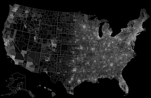
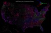
This is a map on of Kerry voter density by county weighted on a logarithmic scale. The most intense county is New York County (Manhattan). Since I set up the scale before trying to find the emptiest county in Alaska, Nebraska, or Montana, I took a short-cut in the formula by taking the logarithm of the density of Kerry voters in voters per square mile plus one as a logarithm of a number less than 1 is negative and there are several counties in the above mentioned states among others with Kerry voter density significantly below 1 voter per square mile.
Now, weighting the map based upon Kerry voter density is far from a perfect solution, but I thought that it was the best at the time because it (1) represents a contest where voting procedures were more similar between states than the current primaries, making them giving a more accurate picture of the distribution of Democratic voters, (2) gives a more accurate reflection of the weighting of delegates to the national convention, as that system is in part based upon the 2004 election (as well as 2000 and 1996) and since (3) allows a look toward the future of the race, as states that have not yet voted are included on the map, something that is not possible with a primary election turnout map (4) doesn't rely upon projections for caucus state turnout (5) allows greater clarity of votes in rural areas; New York City had a higher proportion of voter turnout in the primaries than in the general election in comparison to the rest of the country, and would thus effectively darken the rest of the nation further, obscuring the patterns that the map is meant to show.
That is not to say there are drawbacks. Obviously, this doesn't precisely reflect actual voter turnout and the density of voters from county to county within states may actually be somewhat different in the priamries than in the general election among other problems relating to the fact that this is not weighted by the actual voters, but I personally feel that this is outweighed by the underrepresentation of caucus results in such a map (a state earns a set number of delegates whether 1,000 voters show up or 1,000,000) and the inability to look to the future of the contest.
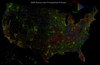
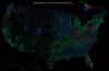
For the following maps, I strongly recommend that you click through to look at the bigger version, since they are significantly darker than the unweighted maps and detail is lost in the smaller versions of the map that are used in this diary.
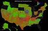
Map weighted by Kerry voter density in 2004
This is quite simply a weighted version of the Modified Michigan map above. Because of the nature of the logarithmic weighting, I felt that using the generic version of the map where Clinton support is shown in a linear intensity scale would give the false impression both that the Detroit area is less populated than it actually is and that it has stronger Clinton support than it actually does (counties with greater voter density tended to vote more heavily for Uncommitted and other non-Clinton candidates, as can be seen in the unweighted maps above).
One of the trends that this map makes abundantly clear is that in most cases throughout the country, urban areas vote more heavily for Obama than the surrounding suburban and rural areas. This is perhaps most clear in states like Tennessee, Ohio, and Missouri, where the rural areas vote strongly for Clinton and the urban areas lean Obama, leading to much closer contests and in the case of Missouri, a different winner than one would suspect by looking at the unweighted map.
It also drowns out the statistical noise that comes from low voter turnout like in one counties in rural Nebraska where the solitary voter voted for Clinton, thus making the county seem like a strange blip on the unweighted map as well as showing where a candidate's true support base in a state is. For instance, it is clear that many of the Clinton votes in Texas came from the El Paso area and from latino communities in the very south of Texas rather than the Texas panhandle, which though stronly leaning toward Clinton is rather sparsely inhabited.
Weighted map with Florida and Michigan removed
Since one of the strenths of the Kerry voter density weighting that I cited was the better reflection it gives of delgate power (though still far from perfect), I had to make a map removing the two states that have been stripped of delegates.
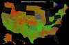
Weighted map showing future contests
Another strength I cited was the ability to look forward using the Kerry voter density weighting. In past diaries, commenters have noted that if broad trends continue as expected, Kentucky, West Virginia, and Pennsylvania should go to Clinton, with Oregon, Montana, South Dakota, and North Carolina going to Obama and Indiana being a tossup.
In this version, I've added a gray coloring to states that have yet to vote and in fact, they are colored as they would be if voters in each of the remaining counties voted in equal parts for Clinton, Obama, and Edwards, which is unlikely. What this shows, though, is that Pennsylvania may not be such a lost cause and that Indiana may have a more pro-Obama disposition than would otherwise be predicted.

Weighted map showing future contests with Iowa modified
The one point of difference between this final map and the previous map is that instead of using the results of the Iowa caucuses where Edwards did quite well, I have used the results of the Iowa county conventions, which shifted toward Obama, as I described here. I added this map, not because I think that it better reflects the will of Iowa voters (it doesn't), but rather because it better reflects the regional Clinton-Obama leanings and because, with the better performance by Edwards here, Iowa looks rather similar to states that have not yet voted, and thus clouds our view toward South Dakota, which shares a border with Iowa, a border along which the highest concentration of voters is present.

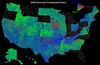
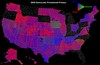
As a final note, the color swap versions allow you not just to find a more favorable color for you candidate of choice (I remember that one Clinton supporter felt that blue was a more suitable color for Clinton, an understandable sentiment), but also, especially in the case of the weighted maps, allows one to get a better contrast in terms of candidates' strong areas. Green is a much brighter color on most monitors than blue or red, which can be a bit jarring in the unweighted maps and can overaccentuate a candidate's strength in both types, but it is also more visible and so, in the dark weighted maps, it may allow you to better see trends (though I suggest looking at both a version where Obama is green and one where Clinton is green to get a more complete picture).
