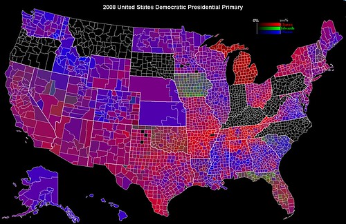
As promised, I have updated my map of the primary results by county so far. The most obvious update is that Mississipi's results are included.
As well, I used the Vermont Secretary of State data to find the actual Edwards vote there, correcting an estimation I had made earlier. Like the update of California for the post-Wyoming update, this is not noticeable.
The third update is, as promised, a more detailed look at North Dakota.
Swapped colors and further explanations after the break


I will make a disclaimer that the Mississippi results are not complete (beyond the three counties, Tishomingo, Oktibbeha, and Hinds where not all precincts have reported), because most media outlets have (understandably) stopped reporting the total number of Edwards votes by county, so I simply did an estimate, based upon the state-wide ratio of non-Obama, non-Clinton votes that went to Edwards.
I had done the same thing with Vermont before I could get the Secretary of State data and that was the main point of the update there, though there were differences in the Obama and Clinton votes as well, though in the end, the update isn't noticeable.
In North Dakota, I did something similar to what I did in Alaska. Both states organize their caucuses by state house district, so all boundaries shown in those two states are state house district boundaries. However, because of how small urban districts are, I merged them with the surrounding rural districts in both states
There were some differences between the two states. In Alaska, the results are given by district, so it was a simple matter of plugging in the numbers and deciding which districts should be merged. In North Dakota, the merging decisions were actually comparatively easier, because many of the caucuses were shared between multiple districts (for instance, all the Fargo districts shared two caucus locations, both of which were in Fargo), but it was more difficult to organize the results because they were given by location.
Now, these maps have multiple limitations. They do not show what states a given candidate "won" or by how much for several reasons. First, the map is a representation of geographic area, not a cartogram of voters, population, or delegate power, so rural areas are overrepresented visually in proportion to their votes/influence. This benefits Obama vissually in some places, mainly the great plains and mountain where he won that have relatively sparse populations. On the other hand, outside of New England, Obama tends to do better in urban areas than rural areas, which gives Clinton an edge visually.
An example of both effects can be seen in Nebraska. In the map, Nebraska is divided by congressional district instead of county, since that was the most detailed data I could find (the same is true for Kansas). Nebraska has three congressional districts, each having roughly the same population. However, it is clear that District 3 is much bigger than District 1 (the medium sized one) or District 2 (the small one, which mainly includes Omaha) since it has the lowest population density. It is also the most pro-Clinton (Obama won it by a narrow margin) as compared to the more urban District 1.
Now, Nebraska is much more rural than any Northeastern state and thus, even with a much smaller population, it has an area that is larger than that of New York, which is a pro-Clinton state. Of course, New York is more pro-Clinton in the more rural upstate region than in New York City, which is a major population center, which increases the Clinton bias of the map.
So, what the map is really good at showing is geographical voting trends and geographical polarization. For instance, strongly pro-Obama Minnesota and Wisconsin are much less geographically polarized than Southern states like Tennessee, Mississippi, Georgia, and Alabama. Of course, comparing my map to this census map, it becomes very clear that this polarization is largely along racial lines. It doesn't take a wild stretch of the imagination to guess what West Virginia and Kentucky will look like.
I also want to address the frequently mentioned point of Florida and Michigan (especially Michigan). It is true that neither of those contests won any delegates and it is true that Clinton was the only one on the Michigan ballot, but both of them show interesting trends nonetheless. For instance, you can see that Edwards did quite well in the Florida panhandle and in the everglades. Of course, since Michigan is rather monotone, simply showing different shades of red, the trends aren't as apparent. But if you look carefully, you will see that the area around Detroit is fairly dark (meaning a lower percentage of Clinton votes) wheras other areas are brighter.
Another complaint with regard to Michigan is that since it is red, it gives the false impression that Michigan is an absolute Clinton-loving state, which given here 55-40 finish against Uncommitted in a contest that garnered no delegates is clearly not true. However, this map is not designed to be used for simple propaganda purposes like the county maps like this 2000 election map, for instance. My map is carries the most meaning when the observer has good knowledge of both U.S. geography and the Democratic primary so far.
In the end, this is not a delegate map or a map meant to reflect the popular vote accurately but rather one meant to show geographical trends
