After the 2004 presidential election, Robert J. Vanderbrei at Princeton released a map of the United States showing the relative strengths of Bush and Kerry's voting base by county which he called Purple America. The map gave a better sense of exactly where the candidates did well and helped dispell the illusion that states were either completely red or completely blue that was created by the coloring of whole states by their winners.
As of now, the site has several maps, including several that attempt to show population by raising those areas, as well as maps from 2000, from the 2005 NJ gubernatorial election, the 2006 Congressional election, and a few maps of the Democrat-Republican balance in these 2008 primaries so far.
It is in that spirit that I created this map of the Democratic primary so far:
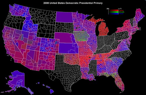
Because of the shrunken size of the image it's hard to see what the colors mean, but basically red represents Clinton, green Edwards, and blue Obama. Obviously, given what red and blue signify during the general election, I've made some variations on the image where I've swapped the colors:


If you want to get a better look, I would suggest looking at the large size on Flickr, which of course is higher resolution.
So, what do these maps mean and how did I create them? Well, for the most part, they show county level data of the races. The exceptions to this are Kansas, Nebraska, North Dakota, Alaska, and Hawaii. Kansas, Nebraska, and Hawaii use Congressional Districts as there smallest level aggregated data, so I was forced to use them instead of counties. Alaska's map is divided into legislative districts, though some of those "districts" are actually aggregates of several districts, some of which are rather small, like those in and around Anchorage. North Dakota also splits its data by state legislative district but it was more of a pain to modify, so I just used the whole state, which happens to be a single Congressional District.
Each county's/district's color is actually determined by the percentage of votes that a candidate won there times the maximum value for that candidates color. So, for instance in Wisconsin's Douglas county, out of a total of 8435 votes, Clinton won 4756 (56.4%), Obama won 3549 (42.1%), and Edwards won 77 (0.9%), so I multiplied 255*0.564 for the red value, 255*0.421 for the blue value and 255*0.009 for the green value.
Obviously, region size is not proportional to area, so this is skewed against urban areas, which means it's skewed against Obama for the most part. However, the map certain shows interesting geographical trends that are much more detailed than are normally seen in winner-take-all state level maps.
I got the information in a large part from the New York Times, though for many of these contests, I supplemented with CNN data, and for some I got it from either the State election commission or the state Democratic Party.
Update:I'm just going to add a few notes. Yes, I included Florida and Michigan despite the fact that these contests were not recognized by the DNC. You will notice that Michigan basically consists of differing shades of red as neither Edwards nor Obama was on the ballot.
I'll also note that some February 5th states had more Edwards votes than others. You can especially see this in Oklahoma, and I think I can remember a few counties in Tennessee and maybe northern Georgia where Edwards actually got more votes than Obama.
For a more qualitative description of the colors, the redder the purple, the more Clinton support, the bluer the more Obama support. Grayish regions had fairly even support for all three candidates. In earlier states, there is more Edwards support such that some counties actually look green. Brownish and yellowish counties are dominated by Clinton and Edwards. Blue-green counties are dominated by Edwards and Obama.
